Table of Contents
How to create a brand guide is something every business owner should understand, especially when inconsistent branding starts affecting how customers perceive their business.
Imagine you’re sitting in a pre-op room, waiting for a complex surgery. You’re nervous. You trust the hospital’s reputation. Then the door opens. Your surgeon walks in wearing a stained t-shirt and sweatpants that are slightly too short. Their hair is unkempt. They’re holding a coffee cup that looks like it was fished out of a trash bin.
Logically, you know clothes don’t affect surgical skill. But in that moment, logic fails. Your brain screams: Run.
We instinctively link appearance with competence. When visual cues don’t match our expectations of professionalism, trust evaporates instantly.
Now apply this to your business. You might offer the best consulting service or the most durable product in your city. But if your website looks broken, your emails use five different fonts, and your logo is a blurry pixelated image, you become the surgeon in the sweatpants.
Psychologists call this the Trust Gap—the distance between the actual quality of your product and the perceived quality of your brand visuals. Research shows that 75% of users judge a company’s credibility based on visual design alone. Three out of every four people will decide if they trust you before reading a single word of your copy.
This guide is your solution to the Trust Gap. Over the course of a weekend, you can build a Brand Kit—a pilot’s pre-flight checklist for your business communication. It ensures every Instagram post, invoice, and slide deck looks like it came from a trusted professional.
Let’s build it.

Saturday Morning: Strategy and Soul
Before you open Canva or look at a color wheel, you must define who you are. Design is a verbal process before it becomes visual. If you can’t describe your brand’s personality in plain English, you’ll never describe it with shapes and colors.
The Cocktail Party Test
Imagine your brand is a person at a crowded networking event. How do they dress? How do they speak? When they leave the room, how do other guests describe them?
If the guests say “they were nice,” you have failed. “Nice” is generic and forgettable. You want them to say “authoritative,” “rebellious,” or “innovative.”
Write down 3–5 adjectives that capture your brand’s emotional, descriptive, and stylistic nature. For example:
- Emotional: How should the customer feel? (Safe, excited, understood)
- Descriptive: What is the nature of the service? (Precise, rustic, industrial)
- Stylistic: What is the personality? (Minimalist, retro, futurist)
The Anti-Adjective
To sharpen your definition, define what you are not. A logistics company might define itself as “Fast” but not “Rushed.” “Fast” implies efficiency and competence. “Rushed” implies chaos and mistakes. By defining this boundary, you prevent your design from drifting into the wrong territory later (like avoiding slanted, messy fonts that look “rushed”).
Aligning with an Archetype
If you’re struggling with adjectives, use Brand Archetypes as a shortcut. These are universally recognized character types:
- The Creator: Values imagination and structure. Visuals are colorful and complex.
- The Innocent: Values purity and simplicity. Visuals are soft, white, and natural.
- The Rebel: Values revolution and defies convention. Visuals are dark, gritty, and bold.
Write down your 3 adjectives and your archetype on a piece of paper. Keep this visible. For the rest of this process, every decision must pass through this filter. If you picked “Rebel,” you are forbidden from using soft pinks and curly fonts.
Saturday Afternoon: Visual Building Blocks
Now select your raw materials: color and typography. This isn’t about personal taste—it’s about psychology and readability.
The Psychology of Color
Color bypasses logic and hits emotions directly. Research suggests up to 90% of snap judgments about products are based on color alone. Map your colors to your adjectives.
Common associations:
- Blue: Trust, security, calm (banks, tech, healthcare)
- Red: Energy, passion, urgency (clearance sales, fitness)
- Green: Growth, health, money (wellness, finance)
- Black/White: Luxury, sophistication, minimalism
The 60-30-10 Framework
- 60% (Neutral Anchor): The dominant color of your brand real estate (backgrounds, whitespace). Usually white, off-white, light gray, or dark charcoal. It allows content to breathe.
- 30% (Brand Identity): The color people associate with you. Used for headers, button backgrounds, or footers.
- 10% (Accent): The call to action. Used sparingly for “Buy Now” buttons or notification badges. It must contrast sharply.
Typography: The Rule of Two
- Headline Font (Personality): For large titles. Serif fonts (with feet) feel traditional and established. Sans serif fonts feel modern and accessible.
- Body Font (Utility): For paragraphs. Its only goal is readability. It should be “invisible” to the reader. Simple is always better.
Avoid using swirly script fonts for body text. If a customer has to struggle to decode the letters, they will stop reading. Keep body text plain so your headline text can shine.
The Coffee Shop Test
Designs often look great on high-def monitors in dark rooms but fail in the real world. Pull up your color combination and font choice on your phone. Go outside or sit in a bright room. Squint your eyes until the image blurs.
- Contrast Check: Can you still see the “Buy Now” button? If it blends into the background, the contrast is too low.
- Readability Check: Can you read the text with sun glare on the screen?
- Mood Check: Does the combination still feel like your adjectives?
If your design fails the squint test, adjust the contrast. Accessibility is a business requirement; low contrast kills conversions.
Sunday Morning: Asset Curation
We have the paint (colors) and the bricks (fonts). Now we build the house. We will curate your logo and imagery—not draw them.
The “Swoosh Fallacy” (Why You Don’t Need a Symbol)
Most founders want a clever icon like the Nike Swoosh. This is a trap. The Swoosh meant nothing when it was created—it took billions of dollars in marketing to teach the world what it meant. You don’t have billions of dollars. If a customer sees a clever abstract shape but can’t read your name, you don’t exist to them.
The Solution: The Wordmark
The most effective logo for a small business is a Wordmark—your company name written in a specific, stylized typeface (think Google, FedEx, Coca-Cola). It offers immediate recognition.
- Type your company name.
- Apply hierarchy: If the name has two parts (e.g., “Smith Consulting”), bold “Smith” and leave “Consulting” regular.
- Adjust tracking (letter spacing):
- Increased tracking adds space between letters—signals luxury and elegance (like Rolex).
- Decreased tracking pushes letters close together—signals impact and urgency (like FedEx, Nike).
Creating a “Visual DNA” for Photography
Inconsistency in images creates the “Frankenstein Effect.” You can’t mix dark, grainy selfies with bright, sterile stock photos. Define your visual DNA:
- Lighting: Hard/bright (high noon) or soft/diffused (cloudy day)? Pick one.
- Color Temperature: Cool (bluish/modern) or Warm (yellowish/inviting)? Never mix these.
- Composition: Cluttered or Minimal?
Rule: Every photo should look like it was shot by the same photographer on the same day. If you use stock photos, use a consistent filter or preset to make them match your custom photos.
Icons and Textures—The “Glue”
- Icons: Pick one style—Outlined (modern), Filled (bold), or Hand-drawn (creative). If you choose outlined, every icon must be outlined. Use icon packs to ensure consistency.
- Textures: Background singers, not stars. Use subtle patterns (paper grain, geometric grids) at 10–20% opacity. They should be felt, not seen. Never place text over a busy texture.
Sunday Afternoon: Assembling Your Brand Bible in Canva
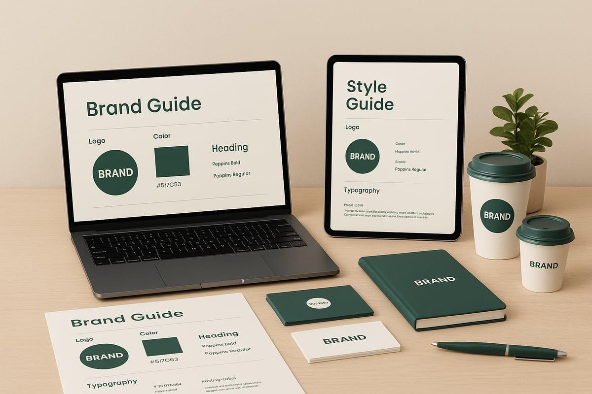
You have all the decisions. Now create the “Source of Truth”—the document that prevents you from making these decisions ever again. Open Canva, select A4 Document, and keep the background white.
Your guide needs five essential pages:
Page 1: Core Values and Voice
List your 3–5 adjectives and your archetype. Reminds anyone using the guide that design is strategic.
Page 2: Logo Usage & Clear Space
Display your primary wordmark. Define “Clear Space”—draw a box around your logo and state that no text or graphics can enter this zone. Show the logo on white and on dark backgrounds.
Page 3: Color Codes
Don’t just put colored squares. List the data:
- HEX Codes: For web/screen (e.g., #0047AB)
- CMYK Codes: For printing physical goods
- RGB Codes: For digital displays
Purpose: Eliminates guessing. “Navy Blue” is subjective; “#0047AB” is a fact.
Page 4: Typography Hierarchy
Display your two fonts (Headline and Body). Specify formatting rules:
- “Headlines must always be Uppercase, Bold, 32pt minimum.”
- “Body text must be Open Sans, Regular weight, never smaller than 12pt.”
Page 5: Imagery & Dos and Don’ts
Show examples of your visual DNA. Include rules like “Always use warm lighting” or “Never place text over busy textures.”
Export as a PDF. Save it to a cloud folder named “Brand Kit” with two subfolders: “01_Print” (for CMYK codes and vector files) and “02_Digital” (for RGB codes and PNG files). Use a clear file naming convention like [BrandName]_[Element]_[Color]_[Usage].png.
Monday and Beyond: Maintenance and Auditing
You’ve built the kit. Now defend it.
The Boredom Paradox
In a few months, you will hate your logo. You will be tired of your blue color. You will want to change it. Do not change it. If you’re not bored with your branding, you’re not being consistent enough. You see your brand 500 times a day; your customer sees it once a week.
The Mere Exposure Effect says familiarity breeds trust. The Rule of 7 says a customer needs to see a brand’s message about 7 times before they remember it. If you change your visuals after the 3rd time, you reset the counter to zero.
Conducting a Brand Audit
Search for “Brand Debt”—old visuals that dilute your authority. Check:
- Social Media Bios: Do all profiles have the exact same profile picture and bio tone?
- Website Header: Does the logo have enough clear space? Are navigation colors correct?
- Invoices: Update your invoicing software with your logo and brand color.
- Email Signatures: Standardize this across your team. No random quotes or different fonts.
- Business Cards: Recycle any cards with old designs.
How to Evolve (The 10% Rule)
When you absolutely must update your brand, do not reinvent; evolve. Change only 10% of the identity at a time. Update an accent color but keep the primary color. Clean up the font but keep the name. Google has changed its logo dozens of times but kept the same color sequence. They evolved without breaking trust.
Brand Guide: The Bottom Line
You now possess a “Visual Compass.” You no longer need to guess if a font looks “good” or if a color is “right.” You have a system.
A brand is not what you say it is—it’s what you consistently show it is. Every email, every post, and every invoice casts a vote for your identity. If those votes are split between five different styles, you lose. If they are united, you win.
The design work is done. Now, trust your kit, resist the urge to tinker, and let your brand speak for itself.
Find your tribe.
Most founders try to build their brand alone—guessing at colors, struggling with fonts, and hoping the result looks professional. Momentum is easier together.
Join your people.
Business Builders Circle is a free community of founders, creators, and marketers who share what’s actually working. Inside, you’ll get early access to exclusive resource, private discussions, and behind‑the‑scenes insights from members who are actively building brands that command trust.
Spots are limited to keep engagement high. Founding members get first access to new tools and templates. Doors may close temporarily once we hit capacity.
Now is the time—not someday when you “have more time.”
Join Business Builders Circle today—it’s free.
Your Brand Looks Better With the Right Strategy Behind It
A consistent brand identity helps customers recognize and trust your business. But what happens after you’ve caught their attention?
You need a marketing strategy that turns that recognition into meaningful growth.
Our free Digital Marketing Ebook walks you through practical ways to strengthen your online presence, reach the right audience, and build a brand customers remember.
You’ve built your brand guide. Now give your brand a strategy that works.

 English